Monday, November 8, 2010

word and image

Kate Forrester is an artist who does hand-drawn lettering. She is known for her flowing, swirling typeface. I first learned about her after she designed the paper cut out campaign ad for the British department store John Lewis.

Her words contain lots of flourishes, and the swirls flow out and interlace themselves with images that relate to the words. When the viewer steps back the words seem to intertwine with the image, so the words are the image. The lettering reminds me of art nouveau movement because of all the flourishes.

The ad is designed to look like paper that is intricately cut which gives the ad a home-made feel. It suggests that the gifts you buy from John Lewis are thoughtful and meaningful, like a handmade gift would be.

The words are designed to be the main focal point and the images give the viewer the context of the words, which is different than most designs. Most designs have a huge image that is meant to capture people’s attention, then text to tell us what the image is about.

The word cut-outs make the ad very tactile, like the viewer could reach out and touch the cut outs, which is what makes it so memorable.

Monday, November 1, 2010

art vs. graffiti


         What distinguishes art from graffiti?
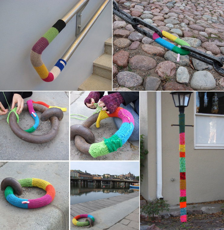
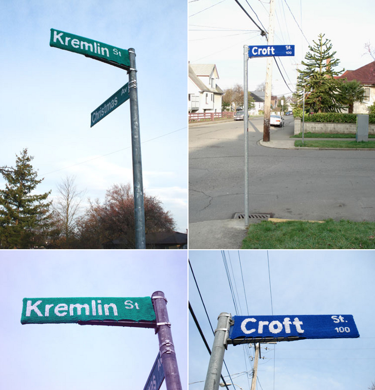
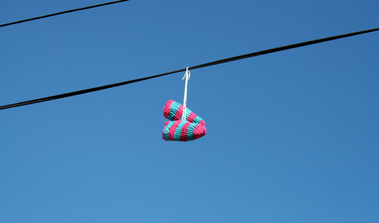
         I was forced to think of this question a few years ago when I came across http://www.knittaplease.com. Knitta is a group of rebel knitters who come and night and tag trees, benches, poles, street signs, and sometimes buildings around the city with their knitted creations. They call it “knitted graffiti”.
images are taken from http://deputy-dog.com/2008/11/urban-knitting-worlds-most-inoffensive.html

         The difference between graffiti and this knitted graffiti is the knitted graffiti is often seen as a work of art, and people rarely remove it. This is quite a contrast to regular graffiti, which people see as an abomination that must be removed immediately. Both are forms of vandalism, but one is seen as extremely harmful, and the other is seen as a piece of art that must be saved.

         Well what is art? It's a creative expression that carries a message. All graffiti is an expression of the creator’s feelings—both the spray painted version and its knitted alternative. So why do people hesitate to dispose of the knitted pieces?


         Perhaps because most people associate knitted items with comfort and home, and the simple piece of yarn brings a sense of humanness to the impersonal urban cities where they are located.
         I have never thought knitting could be considered art, not until I saw this. Interesting idea. If there’s a knitted graffiti group in Sacramento or Davis, let me know. I’d definitely like to join.

The design of a keyboard

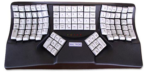
Everyone uses keyboards today. Recently the design of a keyboard has been brought to my attention when someone showed me a maltron keyboard.

Most people use keyboards like on our laptop, but they are ergonomically unfriendly, and our hands don’t like them very much. After prolonged use, they cause arthritis, carpal tunnel, and other issues that make using our hands painful.
The topic of ergonomic keyboards has been brought to me before, but the ones most people are familiar with have the exact same shape, but the keyboard is split in half, and the halves are tilted away from each other. The maltron keyboard is drastically different.
Instead of being flat, like most keyboards, the keys actually curve down, like a valley. Supposedly this relieves your fingers from reaching out for those hard to reach keys, which could cause strain in your fingers. From what I’ve heard, its much more intuitive for your fingers to use this keyboard.
What’s also interesting about the maltron keyboard is it has the maltron layout. The keys are arranged completely differently on this keyboard. A professional keyboardist took note of how frequently each key was used and designed the layout so a typist’s fingers wouldn’t have to leave home row. It’s resulted in faster, more accurate typing (on average maltron keyboard users type about 160 wpm) and less hand strain.
It isn’t sleek and modern like apple keyboards, but it is designed well ergonomically. 

Form & Content: Objectified


In the documentary Objectified by Gary Hurstwit, the film maker wants to make the objects the main focus. He does this by zooming in on the items. By changing the frame so drastically and making the object take up most of the composition, Hurstwit forces the viewer to concentrate on the item instead of the background or any of the objects around it. When trying to get the viewer to concentrate on the plates on the table in the introduction, he only shows the plates on the table instead of the entire table with people sitting at it. If he were to include people, the people would instead be the focus of the shot.
Hurstwit uses negative space within the composition to his advantage. By keeping backgrounds simple and focusing on the object, the object becomes the figure and the people using the products become the ground. This was prevalent in the beginning scene where the man is carving the edges off the chair.
An excellent example is when Hurstwit shows us how many designed objects a person uses a day. He focuses on a couple making breakfast, and within the few minutes required to make eggs and toast, the people use dozens of objects.

Monday, October 18, 2010

Design as a Conversation

            Design is a conversation. Just like a conversation, design tries to convey a certain message or idea. Just like a conversation design has a specific audience they’re trying to speak to. And just like a conversation it tries to spark new conversations.
            Recently I came across this infographic “American Kills” by Sebastian Errazuriz on designboom.com.

This is an excellent example as design as a conversation. It shows how Sebastian Errauriz was trying to get a point across to his audience like a conversation, but unlike a conversation his point is made through images and not through words. This design is so simple and so powerful. It beautifully and effectively conveys the message Sebastian Errazuriz wants it to. It’s hard to not be shocked by the reality of all the deaths of American soldiers. The simplicity of the design aids the viewers’ eyes to compare how many suicides there were compared to deaths in Iraq.

When Errazuriz first learned the shocking statistic, he wanted to tell people. But then he realized that it would be best if he showed people by painting it on the side of his studio in Brooklyn so everyone who passed by could see it.

Design Boom conducted an excellent interview with the artist. Here’s what Errazuriz had to say about it:
the counting of dead soldiers outside my studio was long and surprisingly eerie; it was hard to forget that every brush stroke was a soldier who had died the previous year. a lot of people stopped to read the mural and were immediately impressed by the reality portrayed. most of them seemed quite shocked and approached me to ask if what I was painting was real. I tried to explain that I simply wished to create a physical image that could capture people's imagination, creating awareness of the current numbers in death, war and the infinite discrepancy between the resources and energies destined to fight and protect soldiers at war versus the energies invested in protecting their mental health and stability”

Read more about it here:
http://www.designboom.com/weblog/cat/10/view/11233/sebastian-errazuriz-american-kills.html

Sunday, October 17, 2010

Unity

       The book we are reading in class Design Basics by Davis Lauer and Stephen Pentak discussed in one of its beginning chapters that designers attempt to create unity within their designs. They do this by arranging the objects within their composition through use of proximity, repetition, and continuation.
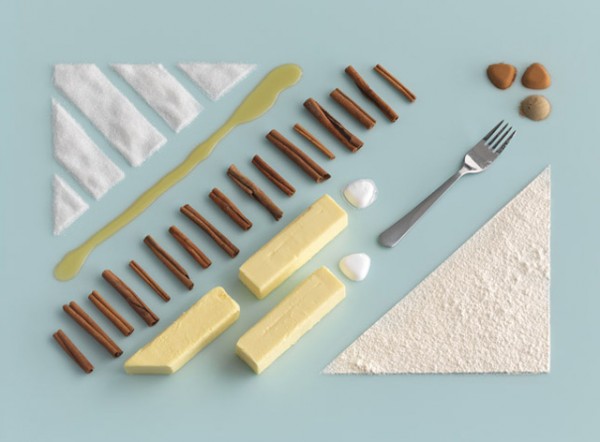
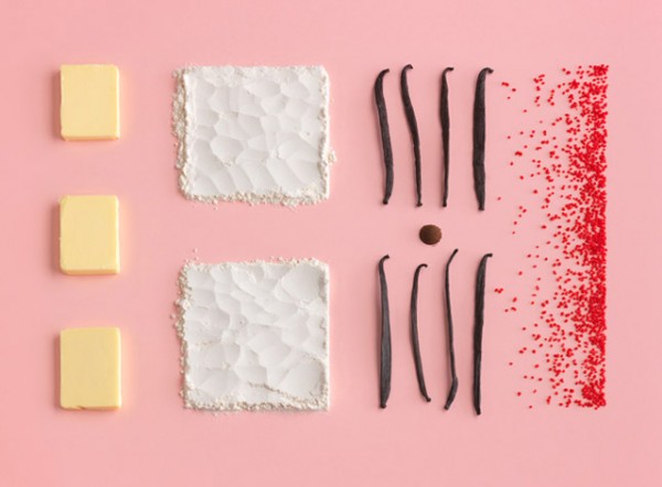
Evelina Bratell has mastered this technique which is clear when she paired up with photographer Carl Kleiner to create a baking book for IKEA called Homemade is Best.

       What's so interesting in her use of these concepts. She masterfully repeats the use of the 45 degree angle which leads our eye across the work. She lined up the stick of butter with sugar, a fork, and a small pile of cinnamon which visually helps the viewer imagine a continuing line connecting those items together. Then, the flour, edge of the butter, and cinnamon all help create a visual frame around the whole composition by creating another continuous rectangle around all of the ingredients.
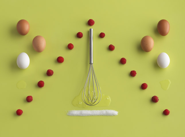
In this image she uses repetition to create visual unity. She repeats the shape of a simple triangle between the raspberries and sugar, as well as the eggs on either side of it.

Her meticulousness to get everything to line up perfectly pays off and she ends up with a great, visually-appealing, and hunger-inducing design.

Comparing and Contrasting

About a month ago, the Democratic National Party redesigned their old logo to a new logo that’s supposed to be more inclusive and more modern. While I do agree with the modern part, it is definitely not inclusive, nor does it speak to what the Democratic Party is about.
Taken from the Democratic National Party's Facebook page
The old logo was patriotic and familiar, albeit antiquated. This new logo does not say any of that. It's a circle, with a "D" in it. I suppose the party was trying to design a logo like Facebook's so they could try to get younger voters to the polls. But by catering to that specific age group, they’ve excluded anyone over the age of 25, which is the vast majority of their party. People in their 70’s who have been voting for half a century certainly do not relate to the new logo.

The Old logo


Taken from the Democratic National Party's facebook fan page

Besides that, it’s just a bad logo. Logos are supposed to be recognizable and memorable. If I saw the letter D with a circle around it, I certainly wouldn’t think “Democratic National Party”. It looks like a logo for Target or a kid’s TV show, not an old, established, political party. The D in the circle does not speak to their values or their specific party like the old one did. This new logo says that it's a modern, passing trend that will eventually be obsolete once the fad passes, while the old one said that they were an established patriotic organization that's committed to doing what they think is best for the country.
The most recognized symbol of the Democratic National Party
I suppose the logo is supposed to give a nod towards President Obama’s extremely successful one, especially with their new slogan “Change that matters”, but Obama’s was a bit more complex than a letter in a circle. Besides, it also points to how short-lived this logo will be. If there’s such an Obama-heavy tone, in 6 (or 2) years it will no longer be relevant and will no longer speak for an entire party but for a past president. This is obviously a logo that is supposed to be temporary.
I do like that the Democrats are trying to brand their party. The past few logos haven't been recognizable and the donkey was by far the most recognizable out of all of them. But the antiquated donkey needed to go, but maybe a stylized, sleek, modern-looking donkey would’ve been better. This new design does not scream patriotic like the old one did.