Monday, November 29, 2010

design is dangerous


Paper or plastic?
It’s the choice we’re faced with whenever we go to a grocery store. We must choose between the recyclable, stiff, paper bags with the handles that are easily ripped off. The brown ones which cut into the edges of your hands and break open and spill their contents when you have a wet object in it. Or the lightweight, flexible, plastic bags that can easily be rolled up and shoved into small places?

            Most of us would rather choose the second option— the convenient plastic bag. The plastic bag is a much more convenient option because of its flexibility and water resistance. The design of the plastic bag is so simple and practical that it becomes the choice of many consumers each year. But, this convenience is destroying the planet and threatening the oceans.
            In 2002, over 5 trillion plastic bags were produced, and it all ends up in our landfills, or blowing away until it makes the end of its journey in the middle of the ocean with all the other trillions of plastic bangs each year. It is met with toothbrushes, bottle caps, tires, netting, rope and other disposable items in this gigantic swirling mass of human waste called the Pacific Trash Vortex.

            Thankfully, many people have caught onto this trend and have started designing reusable grocery bags. While it is a bit more of a hassle, shoppers must realize how much they are impacting the planet. The design of the plastic bag is dangerous to our futures. Consumers need to learn to pick the sustainable option instead of the more convenient option.

design in society

Look around a public place and I guarantee you that you will see a box hanging from the ceiling that contains glowing red or green letters that read E-X-I-T. What is it? It’s an exit sign. This simple design can save lives. It points people in the correct direction to the nearest emergency exit, which is why so many fire, building, health and safety codes require such a simple sign. All around the globe, all public buildings contain this basic sign which con sometimes include a little man running out the door.

This is a universal symbol for emergency exit. Can you imagine a world without a heavily regulated design? The emergency exit symbol could be hidden on the floor in some fancy, tiny lettering you can barely read that blends in with the décor of the building. Then a fire occurs and people are frantically looking around for the nearest exit. Foreigners have no idea what to look for, and you might be having just as much trouble locating the obscured sign. With the universal glowing symbol located on the ceiling, it is much easier to spot. This is because the design is so simple, it is universally understood that it is the sign that points to an exit and cannot be mistaken for anything else. It is also a blaring, unavoidable design that can be seen by everyone who looks up. Our society depends on the consistency of these designs to save lives and get as many people directed to the doors in emergency situations.

color transforms


            London is famous for its bright red double decker buses. They are tourist attractions and many visitors enjoy sitting on the top level of a double decker bus and taking pictures of the city.
            The double decker buses in London are painted a rich, vibrant red. Its bold color choice is what makes the buses stand out so much and its what makes the buses so iconic.

            The bus contains many little details such as a white stripe that lines the bus as well as the dark windows. The warm hue of the bus makes the bus warm and inviting, instead of loud and overbearing. But nonetheless, the red is still a bold color choice.

            Today, many different countries use the double decker buses, it’s not just London anymore, but London is the place most famous for using them because of the bold color combination. In Germany, the buses are a bright yellow, and in other countries they are painted with fancy designs along the sides. Recently, the buses have started to gain some popularity because it’s more efficient to use a bus that’s twice as tall rather than bring out an entirely different bus to transport passengers on a busy bus line. That is one of the huge advantages of double decker buses. It's amazing how after all these years, the red still looks fresh and modern, yet the details of the bus keep it looking classic.

Monday, November 15, 2010

Check It Out

          Will.i.am and Nicki Minaj recently released a video for their song Check it out. Their music video contains a neutral background throughout the entire video, while brightly colored Korean words pop out from behind them as they are singing. This video attempts to imitate k pop videos, but does a poorly made, cheap, and offensive rendition of it which ends up mocking kpop videos.
http://www.youtube.com/watch?v=pqky5B179nM
            K pop videos usually feature lots of clean in-sync dancing similar to that of boy bands in the 90s. Check it Out makes a mockery of the background dancers by simply applying a cheap video mirroring trick to will.i.am’s dancing to attempt to get the same effect. Also, kpop videos feature dancing that is very precise, clean, and consistent. This video makes a poor attempt to imitate that.

Koreans and other Asians are often mocked for wearing shirts with words they do not understand. This video makes a mockery of that with the bright flashy Korean letters in the background that most Americans cannot read.

The part that especially bothers me is when Nicki Minaj contorts her face at 0:40 seconds. In the many Korean music videos I have watched, none of the kpop stars have done that. If anything, they try to make themselves look cute and adorable, not horrible with contorted faces. I also do not understand her excessive blinking, her make up to make her eyes look slanty and her attempt to act air-headed and silly. And what’s with the robotic Asian audience?

Of course my opinion is extremely biased because I found her last video Your Love extremely offensive (as well as this one). She needs to learn to respect the Asian culture instead of mocking them. So far she’s ridiculed the Japanese and Korean culture. Which culture is next on her list? Turns out, I'm not the only one offended. My roommates (who are huge fans of kpop) were offended too, as well as these other bloggers and their commenters:

http://blog.angryasianman.com/2010/10/wtf-music-video-check-it-out-by-william.html
http://www.racialicious.com/2010/11/01/the-orientalism-of-nicki-minaj/
Minaj also refers to herself as a "harajuku barbie". Not only is this offensive, but it shows her ignorance of what harajuku actually is. Harajuku is NOT wearing a slutty kimono or skanky versions of historical clothing.

http://fourfour.typepad.com/fourfour/2010/06/the-problems-problem.html
http://www.hyphenmagazine.com/blog/archive/2010/08/nicki-minaj-harajuku-barbie
(all the pictures are screen shots from the music video on youtube)

Ergonomics

In an Earlier blogpost, I wrote about the maltron keyboard. I wrote about how it is aesthetically unappealing, but extremely ergonomically friendly. I would like to talk about that some more.
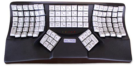
Maltron keyboard
First of all, let’s compare this to other keyboards. Other keyboards use the QWERTY keyboard, which is named because of the order of the keys on the keyboard. Maltron is named after its inventor, Lilian Malt, a keyboard training consultant who wanted a more efficient keyboard. Malt paired with electronics engineer Stephen Hobday who crated an algorithm that calculated how often each letter is typed in the English language. From there, they placed the most often used keys within the home row. 91% of the keys that are typed are within the home row on a maltron keyboard, compared to just 51% on the QWERTY.
ergonomic keyboard
Within a typical day, a typists’ hands move 20 miles, which puts a lot of strain on their hands. The normal keyboard can cause carpal tunnel and a multiple of strain problems, including carpal tunnel and wrist strain. To correct this problem, other companies have developed an ergonomic keyboard that tilts the hands towards each other to reduce the amount your wrists have to twist. Maltron keyboards take it a step further and make it ergonomically friendly not only for the wrists, but for the fingers too by curving the finger area.  The keys curve downwards which is friendlier to your hands because your hands are not designed to stay flat. According to the website, it’s to account for the different lengths of each of your fingers “to reduce movement and tension”. Professional typists claim that they experience no pain whatsoever using a Maltron keyboard, while a normal keyboard or even ergonomic keyboards made typing excruciating.
The Maltron keyboard  improves productivity greatly according to users. Typists claim they can type conversations in real time accurately with the keyboard, with some even claiming the ability to type over 200 words per minute. Typing is apparently much more accurate because your fingers don’t have to move to the side as much, so it reduces the likelihood that your finger will miss. Can you imagine how quick writing blogposts could be? You could be done in under 10 minutes.
According to users, there’s a steep learning curve. It takes about a month to get used to the maltron keyboard, and if the person uses a QWERTY keyboard at any time, it severely hinders the learning curve. This is what makes people so hesitant to switch over. It also makes switching back to a QWERTY keyboard difficult. It’s often very frustrating for the person to go from typing relatively quickly to hunting and pecking. But after that month, you will be typing faster than ever.
regular keyboard

Aesthetically, this is not the best keyboard. Not even close. The keyboard looks old and needs a serious makeover. It’s big and bulky and made of plastic that keyboards were made of in the mid 90s.
            If this keyboard is so great, why aren’t we all using it? It’s because the keyboard is five hundred dollars and the price is off-putting to potential customers (like myself). But apparently it's a great investment because they last for decades.
http://www.maltron.com/component/content/article/16.html
http://www.time.com/time/magazine/article/0,9171,954633,00.html
http://www.gizmag.com/go/4086/

Monday, November 8, 2010

Food styling


Menus in restaurants often feature pictures of delicious food. Well food stylists who design food take these photos and their goal is to make it visually appealing. After all, who wants to order a burger that has a picture of overcooked, old-looking meat with a soggy bun and limp lettuce that doesn’t have a lot of filling? Not me.
From the movie Buy Me That!

That’s why food stylists are here. They make sure they choose the best bun (even if it involves gluing on sesame seeds and painting it with plastic to make it shiny). Then they use a blowtorch to add grill marks to the burger and use toothpicks to prop up the bun and make it seem like it has more fillings than it actually does. They then choose the perfect lettuce leaf from hundred of different bunches of lettuce. I would not want to eat that burger.

So why do we depend so much on pictures to determine the foods we order? It’s because our culture is so reliant on things that are visual. We could rely on food descriptions that describe the burger, but most of us would rather choose the few items that stand out and appeal to our eyes. I suppose the same thing applies to advertisements. I know lots of people who buy a certain brand of cereal because the packaging looks much more visually appealing than the generic cereal.

Words and images on packaging

When you go to a grocery store and you’re standing in the middle of an aisle, what are you looking at? Ads.

Each of the packaging is an advertisement vying for your attention so you will be tempted to buy it. Usually it consists of the company’s name in huge letters and a picture of the product to give you a preview of what’s inside of the can. In order to catch your attention better, the companies usually add a visual element that pops out of the design to catch your attention.

For example, this Progresso soup can shows that it’s “NEW!” and has “45% LESS SODIUM” in bright green and yellow shapes to capture the shopper’s attention. It also has a green band across the top to designate it as a “HEALTHY FAVORITE”. These colorful shapes and labels are used to give the words a sense of hierarchy to the words. It gives importance to certain words over others. The net weight of the can is certainly not as important as the name of the soup, and so on and so fourth. It’s fascinating to see what marketing tools are used on packaging and how the design is used along with marketing sayings to try to get a shopper to buy their product.

word and image

Kate Forrester is an artist who does hand-drawn lettering. She is known for her flowing, swirling typeface. I first learned about her after she designed the paper cut out campaign ad for the British department store John Lewis.

Her words contain lots of flourishes, and the swirls flow out and interlace themselves with images that relate to the words. When the viewer steps back the words seem to intertwine with the image, so the words are the image. The lettering reminds me of art nouveau movement because of all the flourishes.

The ad is designed to look like paper that is intricately cut which gives the ad a home-made feel. It suggests that the gifts you buy from John Lewis are thoughtful and meaningful, like a handmade gift would be.

The words are designed to be the main focal point and the images give the viewer the context of the words, which is different than most designs. Most designs have a huge image that is meant to capture people’s attention, then text to tell us what the image is about.

The word cut-outs make the ad very tactile, like the viewer could reach out and touch the cut outs, which is what makes it so memorable.

Monday, November 1, 2010

art vs. graffiti


         What distinguishes art from graffiti?
         I was forced to think of this question a few years ago when I came across http://www.knittaplease.com. Knitta is a group of rebel knitters who come and night and tag trees, benches, poles, street signs, and sometimes buildings around the city with their knitted creations. They call it “knitted graffiti”.
images are taken from http://deputy-dog.com/2008/11/urban-knitting-worlds-most-inoffensive.html

         The difference between graffiti and this knitted graffiti is the knitted graffiti is often seen as a work of art, and people rarely remove it. This is quite a contrast to regular graffiti, which people see as an abomination that must be removed immediately. Both are forms of vandalism, but one is seen as extremely harmful, and the other is seen as a piece of art that must be saved.

         Well what is art? It's a creative expression that carries a message. All graffiti is an expression of the creator’s feelings—both the spray painted version and its knitted alternative. So why do people hesitate to dispose of the knitted pieces?


         Perhaps because most people associate knitted items with comfort and home, and the simple piece of yarn brings a sense of humanness to the impersonal urban cities where they are located.
         I have never thought knitting could be considered art, not until I saw this. Interesting idea. If there’s a knitted graffiti group in Sacramento or Davis, let me know. I’d definitely like to join.

The design of a keyboard

Everyone uses keyboards today. Recently the design of a keyboard has been brought to my attention when someone showed me a maltron keyboard.

Most people use keyboards like on our laptop, but they are ergonomically unfriendly, and our hands don’t like them very much. After prolonged use, they cause arthritis, carpal tunnel, and other issues that make using our hands painful.
The topic of ergonomic keyboards has been brought to me before, but the ones most people are familiar with have the exact same shape, but the keyboard is split in half, and the halves are tilted away from each other. The maltron keyboard is drastically different.
Instead of being flat, like most keyboards, the keys actually curve down, like a valley. Supposedly this relieves your fingers from reaching out for those hard to reach keys, which could cause strain in your fingers. From what I’ve heard, its much more intuitive for your fingers to use this keyboard.
What’s also interesting about the maltron keyboard is it has the maltron layout. The keys are arranged completely differently on this keyboard. A professional keyboardist took note of how frequently each key was used and designed the layout so a typist’s fingers wouldn’t have to leave home row. It’s resulted in faster, more accurate typing (on average maltron keyboard users type about 160 wpm) and less hand strain.
It isn’t sleek and modern like apple keyboards, but it is designed well ergonomically. 

Form & Content: Objectified


In the documentary Objectified by Gary Hurstwit, the film maker wants to make the objects the main focus. He does this by zooming in on the items. By changing the frame so drastically and making the object take up most of the composition, Hurstwit forces the viewer to concentrate on the item instead of the background or any of the objects around it. When trying to get the viewer to concentrate on the plates on the table in the introduction, he only shows the plates on the table instead of the entire table with people sitting at it. If he were to include people, the people would instead be the focus of the shot.
Hurstwit uses negative space within the composition to his advantage. By keeping backgrounds simple and focusing on the object, the object becomes the figure and the people using the products become the ground. This was prevalent in the beginning scene where the man is carving the edges off the chair.
An excellent example is when Hurstwit shows us how many designed objects a person uses a day. He focuses on a couple making breakfast, and within the few minutes required to make eggs and toast, the people use dozens of objects.

Monday, October 18, 2010

Design as a Conversation

            Design is a conversation. Just like a conversation, design tries to convey a certain message or idea. Just like a conversation design has a specific audience they’re trying to speak to. And just like a conversation it tries to spark new conversations.
            Recently I came across this infographic “American Kills” by Sebastian Errazuriz on designboom.com.

This is an excellent example as design as a conversation. It shows how Sebastian Errauriz was trying to get a point across to his audience like a conversation, but unlike a conversation his point is made through images and not through words. This design is so simple and so powerful. It beautifully and effectively conveys the message Sebastian Errazuriz wants it to. It’s hard to not be shocked by the reality of all the deaths of American soldiers. The simplicity of the design aids the viewers’ eyes to compare how many suicides there were compared to deaths in Iraq.

When Errazuriz first learned the shocking statistic, he wanted to tell people. But then he realized that it would be best if he showed people by painting it on the side of his studio in Brooklyn so everyone who passed by could see it.

Design Boom conducted an excellent interview with the artist. Here’s what Errazuriz had to say about it:
the counting of dead soldiers outside my studio was long and surprisingly eerie; it was hard to forget that every brush stroke was a soldier who had died the previous year. a lot of people stopped to read the mural and were immediately impressed by the reality portrayed. most of them seemed quite shocked and approached me to ask if what I was painting was real. I tried to explain that I simply wished to create a physical image that could capture people's imagination, creating awareness of the current numbers in death, war and the infinite discrepancy between the resources and energies destined to fight and protect soldiers at war versus the energies invested in protecting their mental health and stability”

Read more about it here:
http://www.designboom.com/weblog/cat/10/view/11233/sebastian-errazuriz-american-kills.html

Sunday, October 17, 2010

Unity

       The book we are reading in class Design Basics by Davis Lauer and Stephen Pentak discussed in one of its beginning chapters that designers attempt to create unity within their designs. They do this by arranging the objects within their composition through use of proximity, repetition, and continuation.
Evelina Bratell has mastered this technique which is clear when she paired up with photographer Carl Kleiner to create a baking book for IKEA called Homemade is Best.

       What's so interesting in her use of these concepts. She masterfully repeats the use of the 45 degree angle which leads our eye across the work. She lined up the stick of butter with sugar, a fork, and a small pile of cinnamon which visually helps the viewer imagine a continuing line connecting those items together. Then, the flour, edge of the butter, and cinnamon all help create a visual frame around the whole composition by creating another continuous rectangle around all of the ingredients.
In this image she uses repetition to create visual unity. She repeats the shape of a simple triangle between the raspberries and sugar, as well as the eggs on either side of it.

Her meticulousness to get everything to line up perfectly pays off and she ends up with a great, visually-appealing, and hunger-inducing design.

Comparing and Contrasting

About a month ago, the Democratic National Party redesigned their old logo to a new logo that’s supposed to be more inclusive and more modern. While I do agree with the modern part, it is definitely not inclusive, nor does it speak to what the Democratic Party is about.
Taken from the Democratic National Party's Facebook page
The old logo was patriotic and familiar, albeit antiquated. This new logo does not say any of that. It's a circle, with a "D" in it. I suppose the party was trying to design a logo like Facebook's so they could try to get younger voters to the polls. But by catering to that specific age group, they’ve excluded anyone over the age of 25, which is the vast majority of their party. People in their 70’s who have been voting for half a century certainly do not relate to the new logo.

The Old logo


Taken from the Democratic National Party's facebook fan page

Besides that, it’s just a bad logo. Logos are supposed to be recognizable and memorable. If I saw the letter D with a circle around it, I certainly wouldn’t think “Democratic National Party”. It looks like a logo for Target or a kid’s TV show, not an old, established, political party. The D in the circle does not speak to their values or their specific party like the old one did. This new logo says that it's a modern, passing trend that will eventually be obsolete once the fad passes, while the old one said that they were an established patriotic organization that's committed to doing what they think is best for the country.
The most recognized symbol of the Democratic National Party
I suppose the logo is supposed to give a nod towards President Obama’s extremely successful one, especially with their new slogan “Change that matters”, but Obama’s was a bit more complex than a letter in a circle. Besides, it also points to how short-lived this logo will be. If there’s such an Obama-heavy tone, in 6 (or 2) years it will no longer be relevant and will no longer speak for an entire party but for a past president. This is obviously a logo that is supposed to be temporary.
I do like that the Democrats are trying to brand their party. The past few logos haven't been recognizable and the donkey was by far the most recognizable out of all of them. But the antiquated donkey needed to go, but maybe a stylized, sleek, modern-looking donkey would’ve been better. This new design does not scream patriotic like the old one did.

Tuesday, October 12, 2010

Designing from without, pancakes edition!


While browsing the web this week I came across this cool little site:
This guy makes pancakes for his daughter. What makes them so original? They’re 3-dimensional!


This is a guy who definitely gets his inspiration from his materials. Who knew you could take flat pancakes and make them 3-D? He started by making flat pancakes in different shapes. From there he began to add color and experiment with different thicknesses of pancakes. It led to him making a turtle out of pancakes. He was experimenting with shapes and if he could make the turtle shell round.

Jim has a channel on youtube, and in the video he shows users his different methods of dispersing the pancake batter onto the griddle. He had an old ketchup bottle, a syringe, and a few other devices. After that he started making bridges and dinosaurs out of pancakes. Stacking pancakes and coloring them only gets you so far.

The creation that stood out to me the most was the ferris wheel he created. The ferris wheel has individual seats on it too! After experimenting with the turtle, Jim discovered that he could make building blocks of pancakes, and then assemble them on the griddle using pancake batter. The secret is over cooking the pancake apparently; he says it makes the pancakes like balsa wood. His pancake “civil engineering” is featured in one of his videos on his youtube channel.
http://www.youtube.com/watch?v=BPzu3Whe4xo

To develop something so innovative from flat, limp pancakes is amazing and takes lots of experimenting and creativity with materials. His pancakes pushed the limits of what we used to think was possible with pancake batter. 

Sunday, October 10, 2010

Design from Without

Everyone knows who Walt Disney is. Just his last name brings up memories of cartoons and theme parks. Walt Disney created an international empire, but where did his inspiration come from?
            Walt Disney gets his inspirations from his environment and places he visited. His most famous character, Mickey Mouse, is internationally recognized and is what made his cartoons famous. Mickey was inspired by a pet mouse he had when he was younger. Originally Mickey was named Mortimer Mouse and looked like a mouse. Disney wanted to make a character that appealed to everyone and he realized that the public loved cute and little animals. He changed Mortimer’s name to Mickey and made Mickey more human-like.
            His inspiration for Disneyland came when he visited Tivoli park in Denmark. Disney’s kids went on the merry go round and Walt Disney had to sit and watch. Disney got the inspiration to create a park that was family oriented that both parents and their kids could enjoy. The park was also disgusting and dirty and Disney wanted to create a park that was also clean.
            Another icon of Disney is Sleeping Beauty’s Castle in Disneyland. The castle is based off of Neuschwanstein castle in Fussen, Germany. Disney loved all the spires of the castle and wanted to make a castle just like it in Disneyland. He loved it so much, he made it the main focal point of the park.
            Another source of inspiration for Walt Disney is The Brothers Grimm’s old folk tales. The Brothers Grimm wrote the Rumpelstiltskin, Snow White, Rapunzel, Cinderella, The Frog Prince and many other stories, which is where Disney got the story lines for some of his most famous animations.

            Walt Disney took ideas from things he had seen and imagined them in his park or as movies. He then tweaked the designs and made it his own design that fit in with the family-friendly theme of his company and made his movies and theme parks appeal to all ages.

Layout

Currently I am the assistant design director for The California Aggie. It is my job to do the layout of the newspaper twice a week and working here has made me think about newspaper design. Newspapers are the main way people receive their information, so the way it is designed has a lot of impact on our society.
Recently I’ve been reading this book The Exception to the Rulers by Amy Goodman and in the first chapter she talks about how the media manipulates the public by only focusing on the same few stories when there are thousands of others out there. She talks about how the media now sets the political agenda because they bring attention to topics that may not be as important as other problems, but the politicians now have to focus on because the public wants them to. For example, Park 51. The “ground zero” mosque was given a lot more attention than it deserved this summer and because the media commented on it so often, it became an important issue in society. It’s disgusting that xenophobic racists were featured in the media and their discriminatory agenda was put at the forefront of society.
Everyone glances at a newspaper every day. It might just be a quick look at the front page, but they receive a lot of information in that second, which is why layout design is so fascinating. It all depends on where a designer decides to place a story. If a story is in big, bold letters all the way across a newspaper’s front page with a huge picture, that is going to get way more attention than a article that takes up a fourth of a page in the middle of the newspaper. If there is a story of a protest and a layout designer puts a huge picture of police beating up protestors, the reader is going to be biased towards the protestors. If a layout designer were to make a picture of an out of control protest the main picture, the readers' opinions of the protestors is going to be a lot different.

http://www.amazon.com/Exception-Rulers-Exposing-Politicians-Profiteers/dp/1401301312

Stone Soup

This week in class we were told to bring in materials for “stone soup”. Stone soup is based off an old folk tale. When I was younger, I learned that it was called nail soup. The moral of the story is that when people work together, they can make something better than they could have individually.

My group brought colorful paper, watercolors, bottle caps, cardboard boxes, glitter glue, markers, stickers, and tons of other stuff. With these materials we brought, we were supposed to make something that used the items. After lots of discussion, my group ended up making a very colorful bus. We covered a box with a lot of patterned paper and some sticks we found lying around. For the headlights we used bottle caps and we glued everything on with glitter glue. We cut out little people and windows and doors from the paper and glued it on. We even had a tailpipe on the bus. Meanwhile, someone was keeping track of time so we knew how much time to budget for. Individually my group members couldn’t have done anything like this. You can’t make a bus from bottle caps, paper, or from a box, but when you combine them, its absolutely possible.

Collaboration is a useful tool that improves whatever you are doing. For example, students need each other to study. Individually one student cannot keep up with a professor’s notes and remember all the details, but when there are multiple people who were in class it is possible. The students could study individually, but if they were studying with a group it would probably go a lot smoother.

Monday, October 4, 2010

My First Encounter with Design


When I was younger, my mom used to sew me and my sister costumes for Halloween. I loved the costumes because they were so original, and always turned out better than their store-bought counterparts. This was one of the first moments that I got to see designing first hand.
One of my favorite costumes was when my sister and I wanted to be Mulan for Halloween. My sister wanted to dress up as Mulan when Mulan had to meet the matchmaker, and I went as the soldier Mulan who impersonated her father and went to fight in the war. After my cousin heard about the costumes, he wanted to join us as General Shang.

My cousin as General Shang, my sister as Mulan when she went to see the matchmaker, and I'm dressed as Mulan when she went to war.

My mom couldn’t find a pattern for my sister’s dress, so she used a basic dress pattern. In the movie, Mulan’s matchmaker dress has extremely long sleeves, so my mom altered the pattern for the sleeves so they would be long, just like what Mulan had. I thought it was so cool how she could deviate from a pattern to make it better. Plus, the shades of pink, blue and green on my sister’s costume matched Mulan’s dress perfectly.

For my soldier costume, she used a basic robe pattern and made it shorter so it looked like the soldiers’ uniform from the movies. This was for what the soldiers wore under their armor. The armor on my costume was made of black, green, and grey fun foam that was hot glued together.

For the final touches, my sister and I had our hair put in a bun, I had a plastic sword that I stuck under my belt and wore around, and my sister carried around a plastic crickee we got in a McDonalds happy meal.
What I loved most about the costumes (besides the fact that my mom put lots of effort into them) is that they looked EXACTLY like what Mulan had in the movies­—much more so than what the Disney store had. What do you think?

Disney's Mulan costume 

Zeitgeist

            In class we had to read an article about Zeitgeist and the Zeitgeists of the past generations. Zeitgeist is the “spirit of the times”. Well I think one of the main Zeitgeists of this generation is communication.
            What made me think of communication was youtube. Youtube brings people together. It is so easy to find something in common with someone who laughs at the same videos as you. This bonding comes from videos that have gone viral, that almost every one has seen. There is no better way to connect with old friends than over a video of autotuned news or some other funny video. It has also created new vocabulary (for example, “viral”) which bonds together people of different internet subcultures, like Nerdfighters. It also showcases how our generation has had so much access to other people our age around the world. Many companies have even tried to take advantage of youtube and design their ad campaigns to cater to those who use the internet. For example, Old Spice posted response videos to people that wrote in with questions or comments on their youtube or twitter.
Text messages are a relatively new form of communication. Now almost everyone uses them to stay in touch because they find it so much easier than calling. I have friends who use tens of thousands of text messages, and hardly any talking minutes. Its so easy to just pick up a phone, write the one question you need to ask a classmate, send it off, and get a response a few minutes later. How easy! It has also led companies to use teenagers’ obsession with text messages to their advantage. Cell phone companies have been designing fancier and fancier phones to try to make a profit off of those who can’t live without the internet and music on their phone.
The internet, youtube and text messages all have something in common: communication. Its absolutely fascinating watching all these people connect and make friends from all over the world. I have a few friends I have made from the internet whom I consider to be my best friends. I wouldn’t have met them and keep in contact with them if it weren’t for these new forms of communication.

The Importance of First Impressions


Recently a study was conducted at Ohio State University about first impressions and how they affected college students. 164 Students at OSU were paired up and instructed to talk with each other. After 3, 6 or 10 minutes of talking, students were given a survey that asked them to predict what kind of relationship they would have with that person. When the semester was done, the students were then given another survey and the ones who rated each other favorably at the beginning ended up forming a study group together. What was surprising about the study was the huge effect that negative first impressions had. Classmates who rated the person they were paired up unfavorably avoided talking to the other partner all semester.
First impressions are especially important for college students. You don’t want to give a bad first impression to your roommate when you move into the dorm, you don’t want to show up late to your first day of work or a job interview, you don’t want to look like a messy slob when meeting people in class for the first day when everyone is trying to form study groups, and you certainly do not want to show up late to a professor’s office hours (sorry Professor Housefield). What someone decides about you in the first few minutes determines the type of relationship you’ll have with them.
The Society of Human Resources Management did a study and discovered that 63% of hiring decisions are made within the first 4.3 minutes of a job interview. The rest of the time is spent deciding whether the first impression was correct.
What’s my point in telling you all of this?
First impressions matter.

http://abcnews.go.com/Technology/story?id=69942&page=1
http://www.cvonline.com/content/?id=208&gr=1
http://researchnews.osu.edu/archive/1stimpre.htm